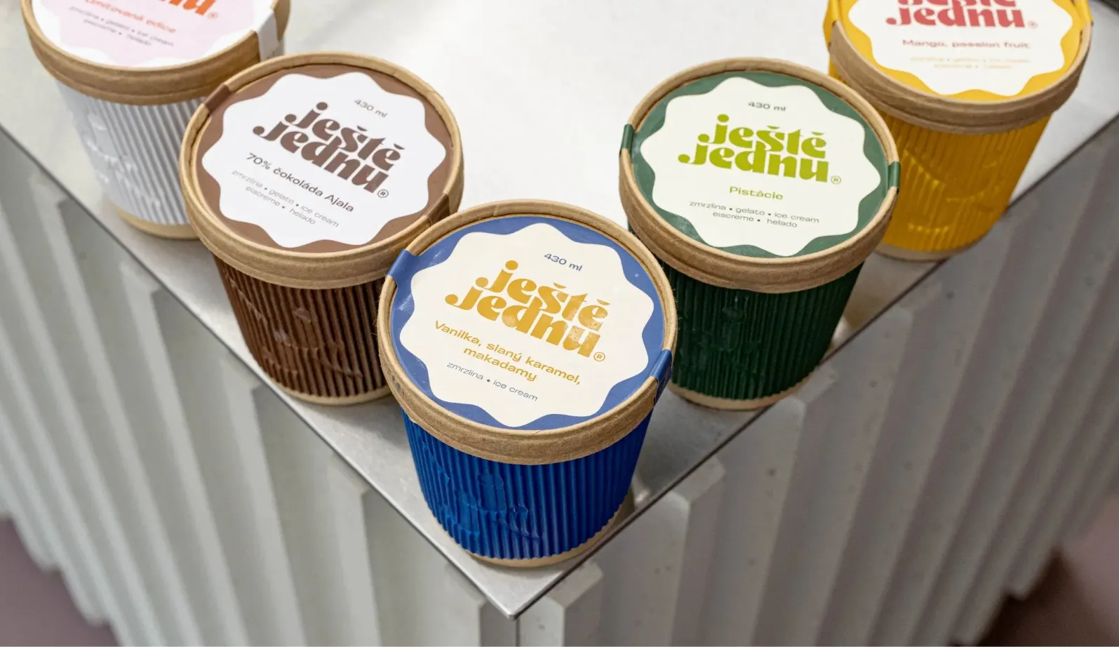
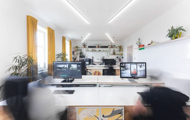
Branding of one-of-the-best brunch venues in Czechia

CLIENTEggo food truck Czechia 2018 - 2021
FieldGastronomy
ROLEBranding Packaging Interior Design
RecognitionJakub Maca

They started out at the legendary Eggo food truck with their famous egg breakfasts. Today they run one of the best breakfast & brunch bistros in the country, Break Feast. Steezy was at the birth of the unmistakable visual identity of both renowned businesses - from the design of the food truck, to the interior of the bistro, to the challenge of how to visually represent the evolution of this popular foodie brand.

Eggo’s minimalist identity based on a graphic acronym - circle, sun, yolk - has evolved into the iconic hen, representing the Break Feast bistro but clearly rooted in the initial symbol.

For the Break Feast bistro, we designed also (as usually) the interior in the spirit of the new branding and with with an unmistakable logo on the wall made from translucent plexiglass. Of particular note is the popular merch, where we designed almost everything – from socks to snapbacks.

The original Eggo brand was based on simple graphic shorthand and playful use of words, materials and illustrations. The minimalist design has also made its way into the styling of the truck itself, complementing the sophisticated yet fun image the guys have been giving us in food and on social media.

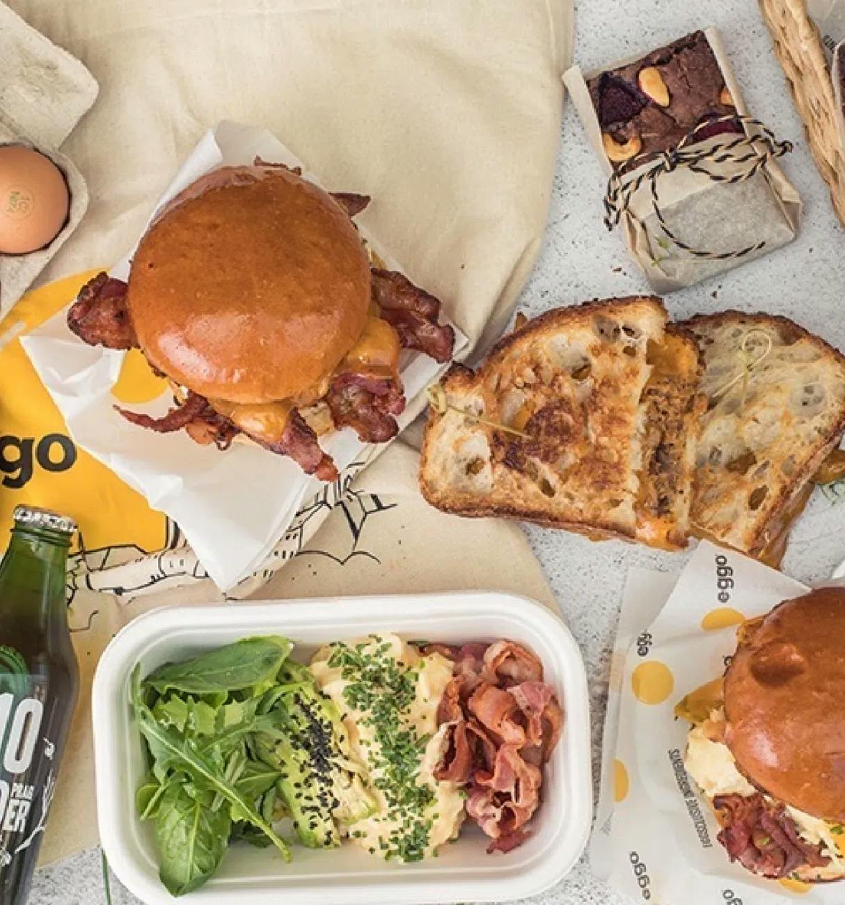
Despite the size of our project, the guys at Steezy approached us with humility, good ideas and reliability. They were always able to align their time approach with our requirements. We recommend them with all our eggs!

Ron Winkler
Founder @eggofoodtruck