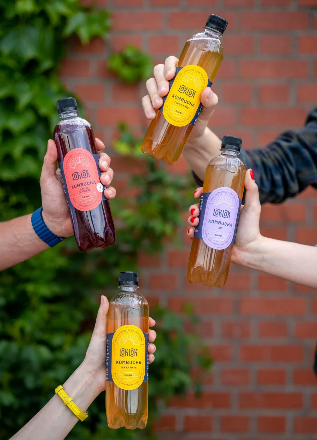
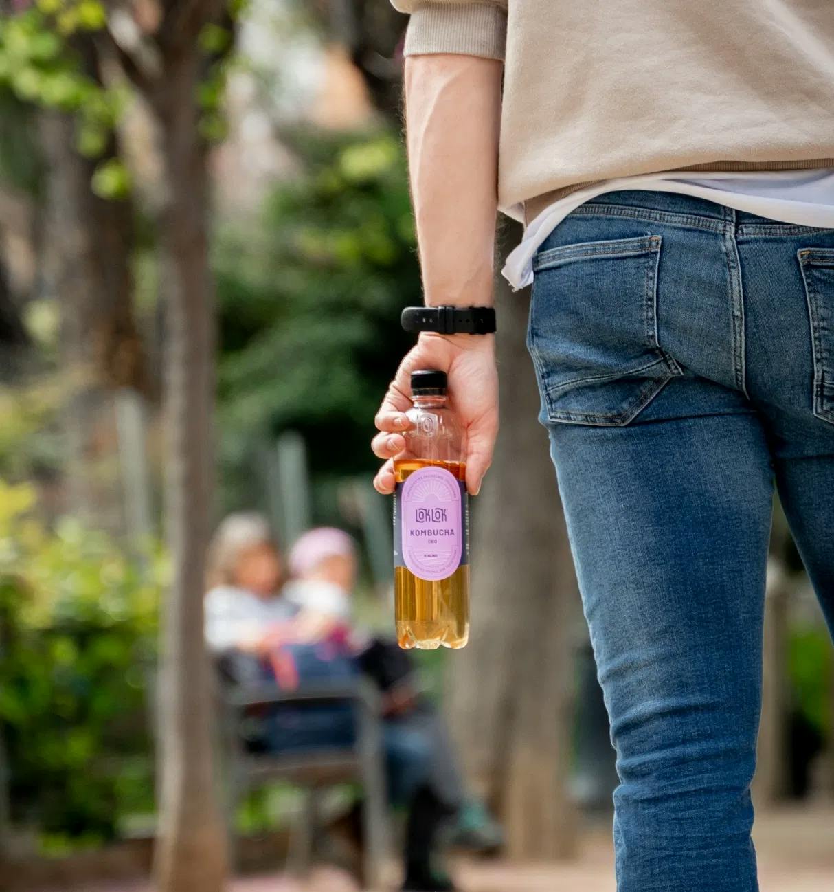
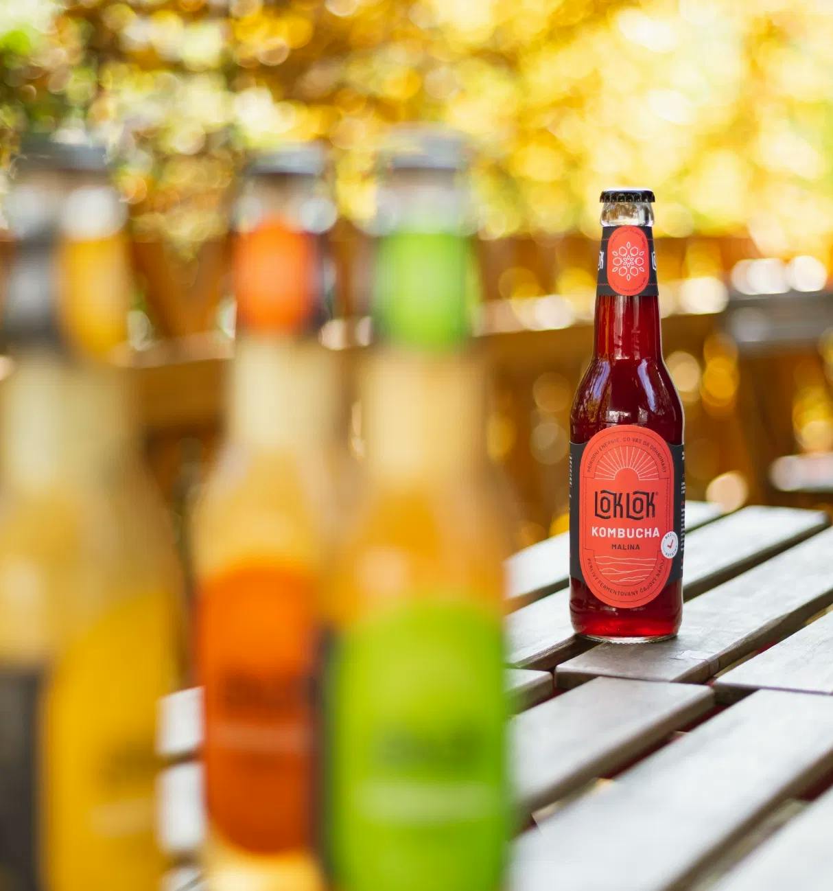
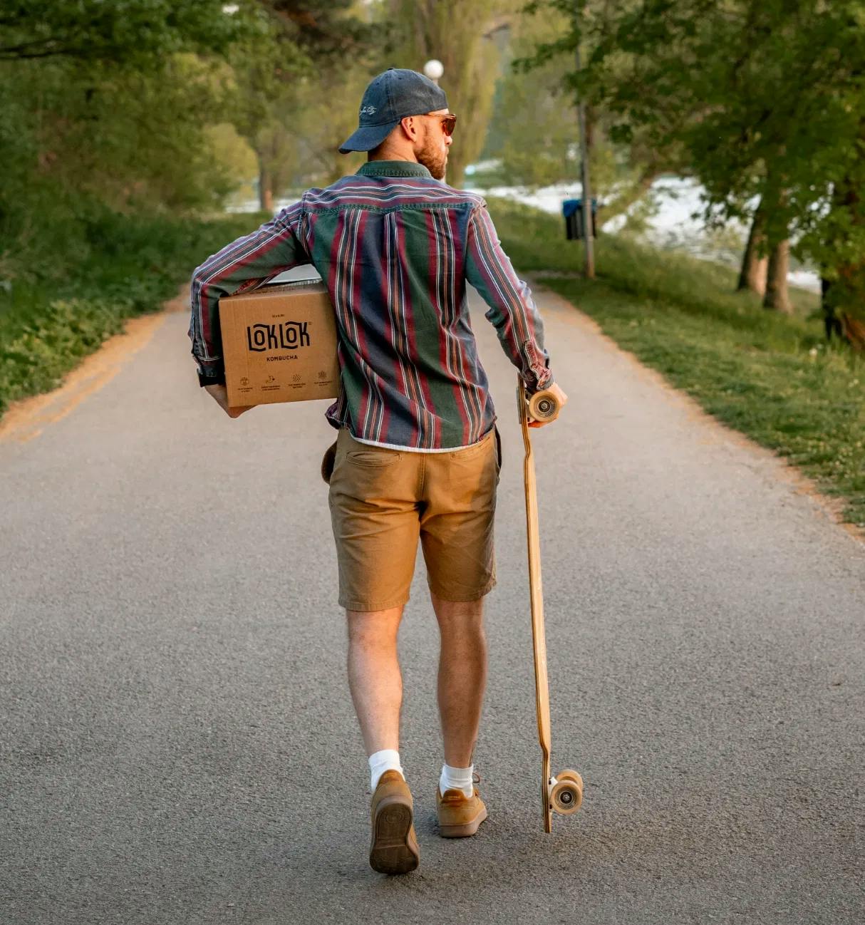
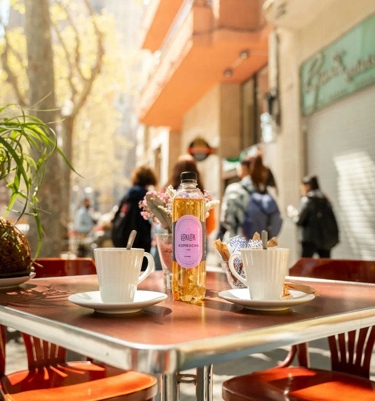
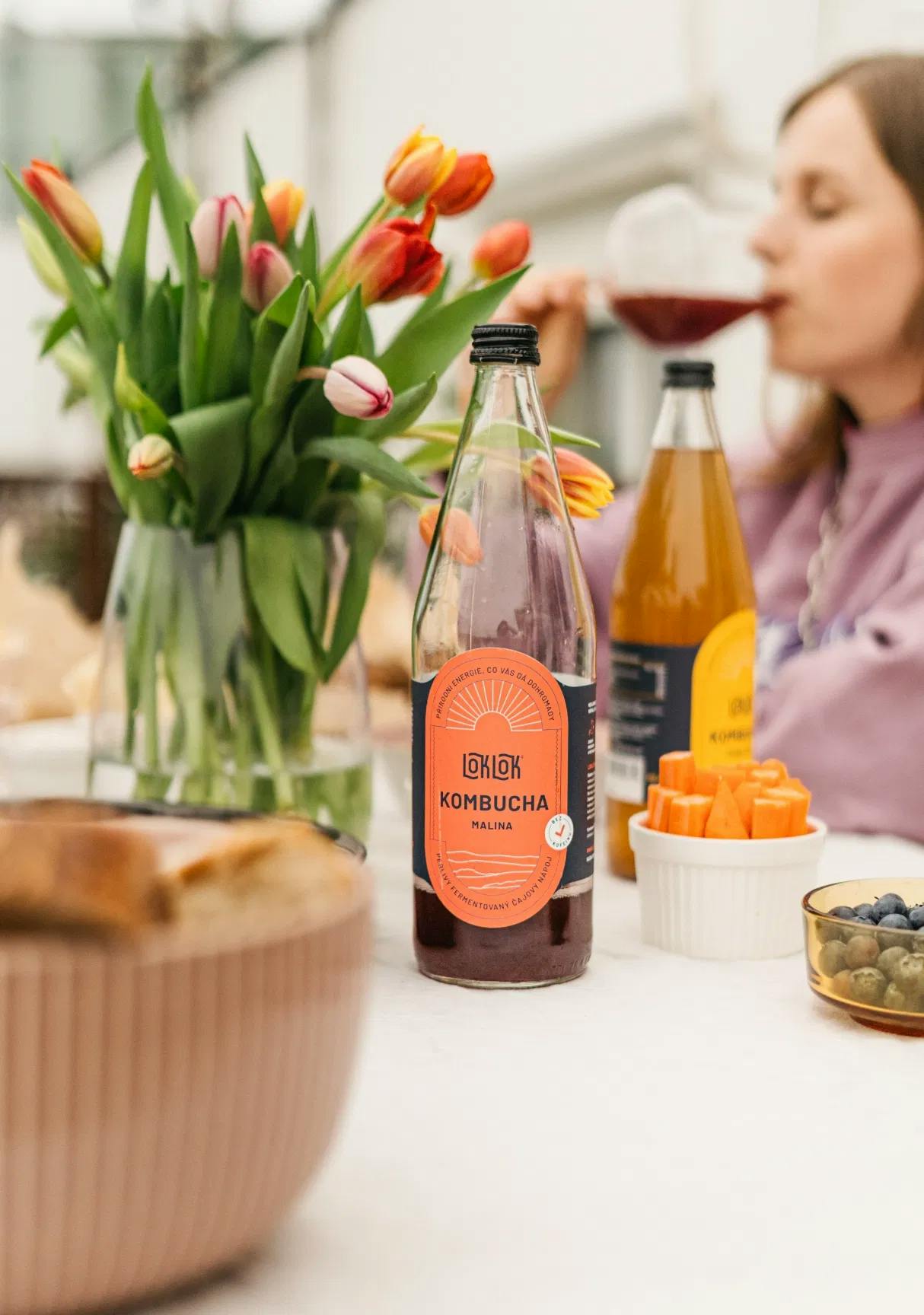
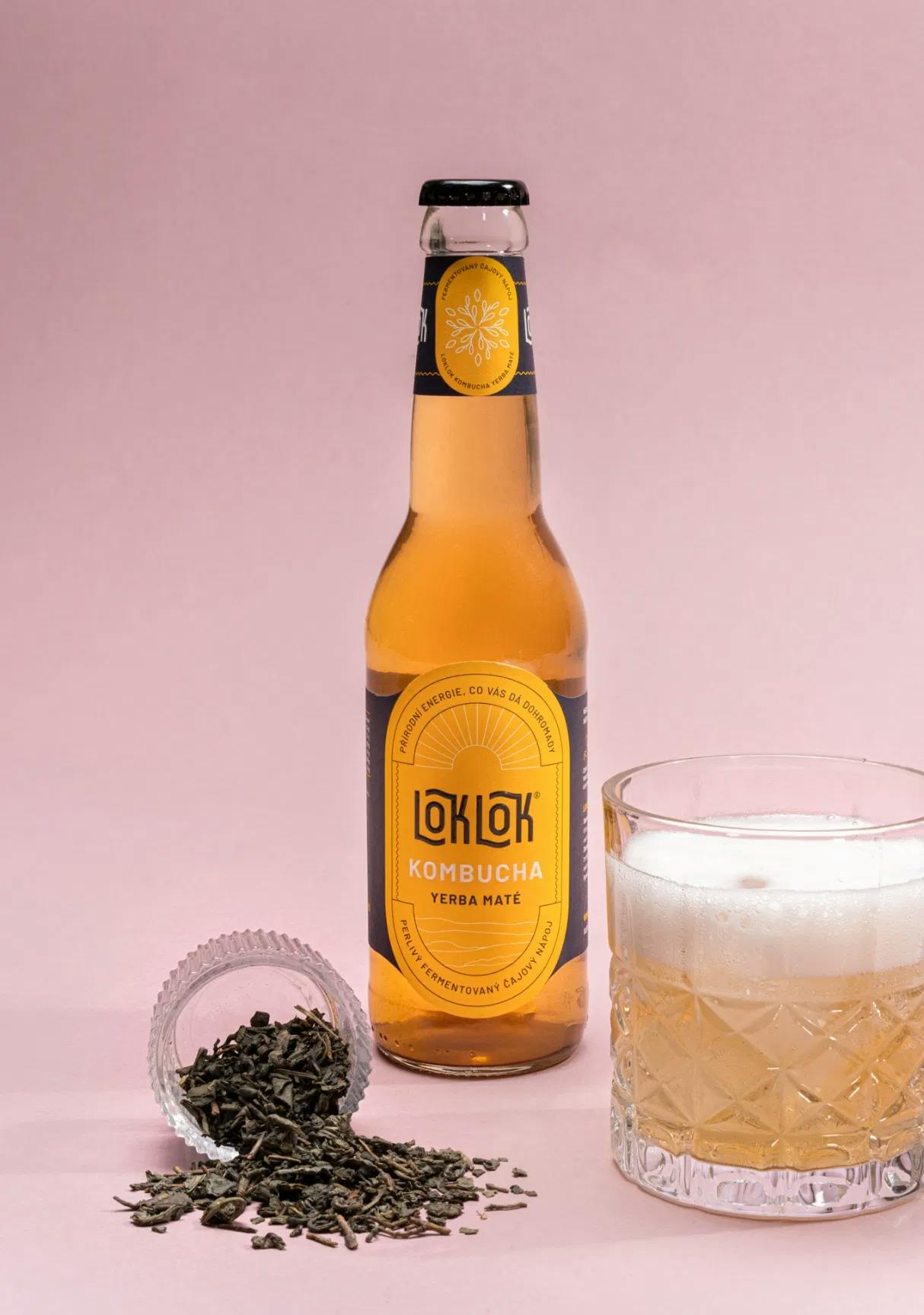
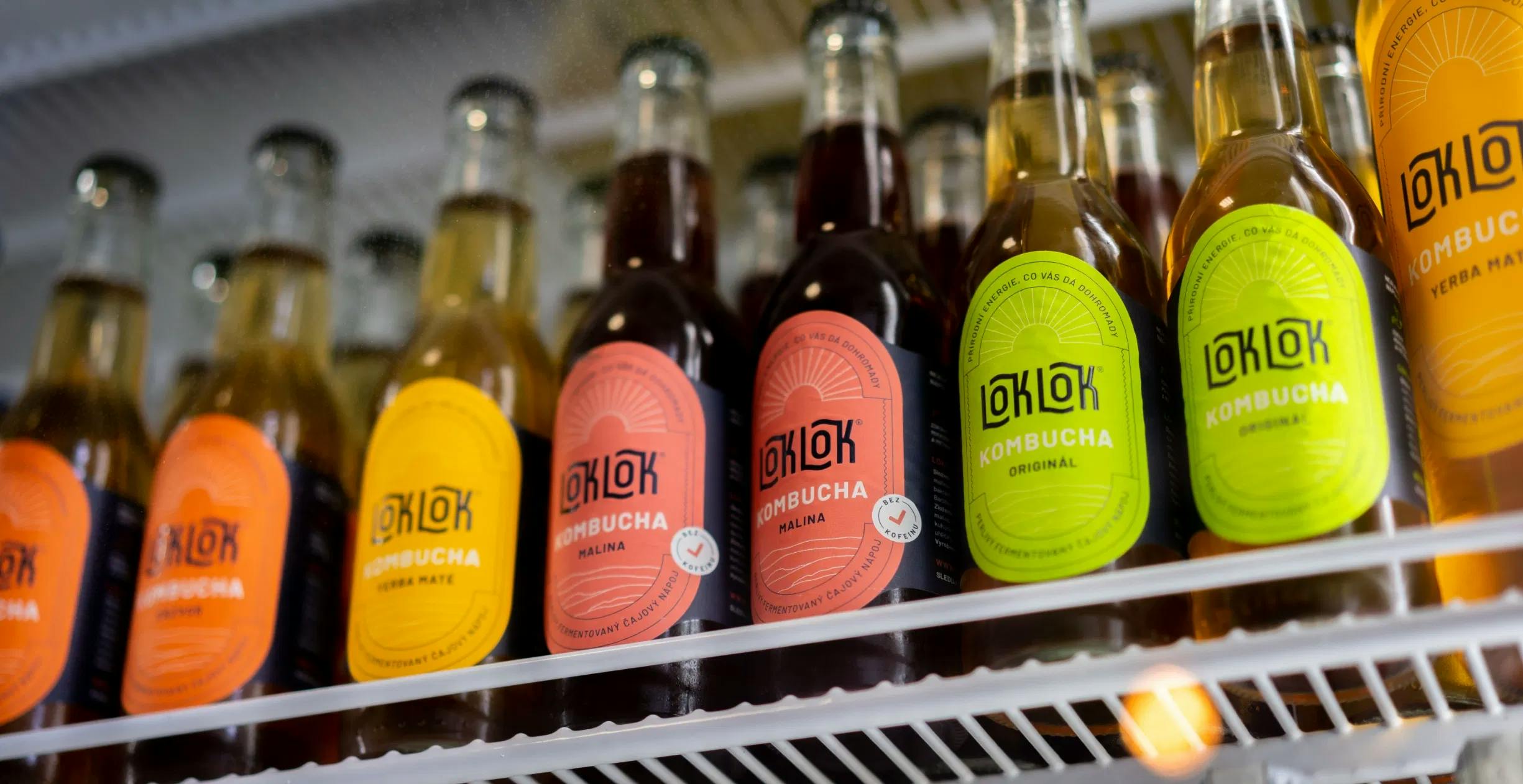
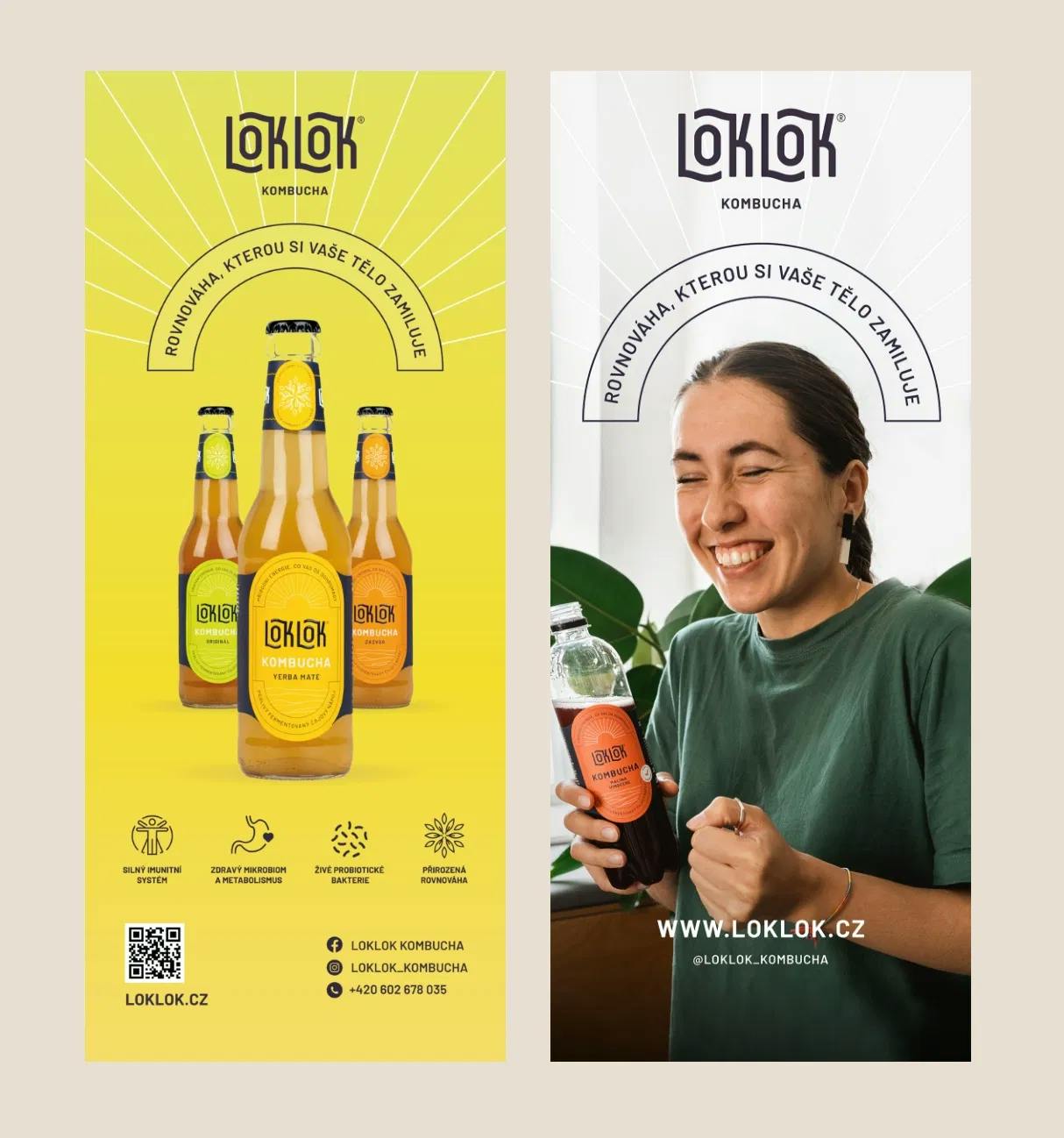
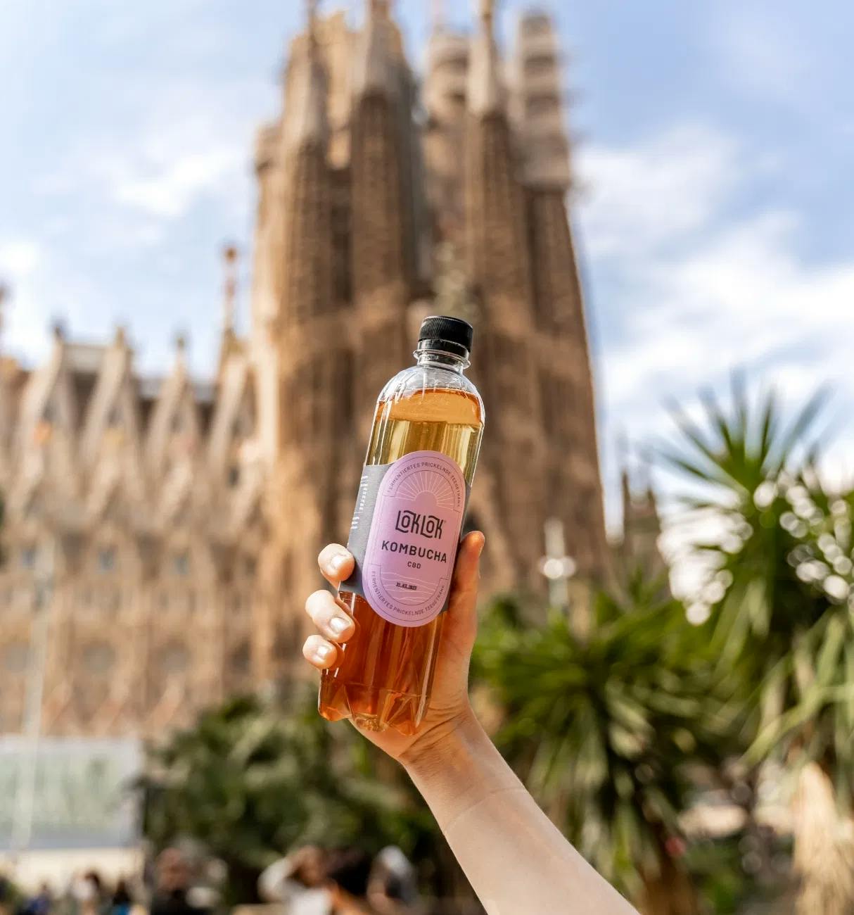
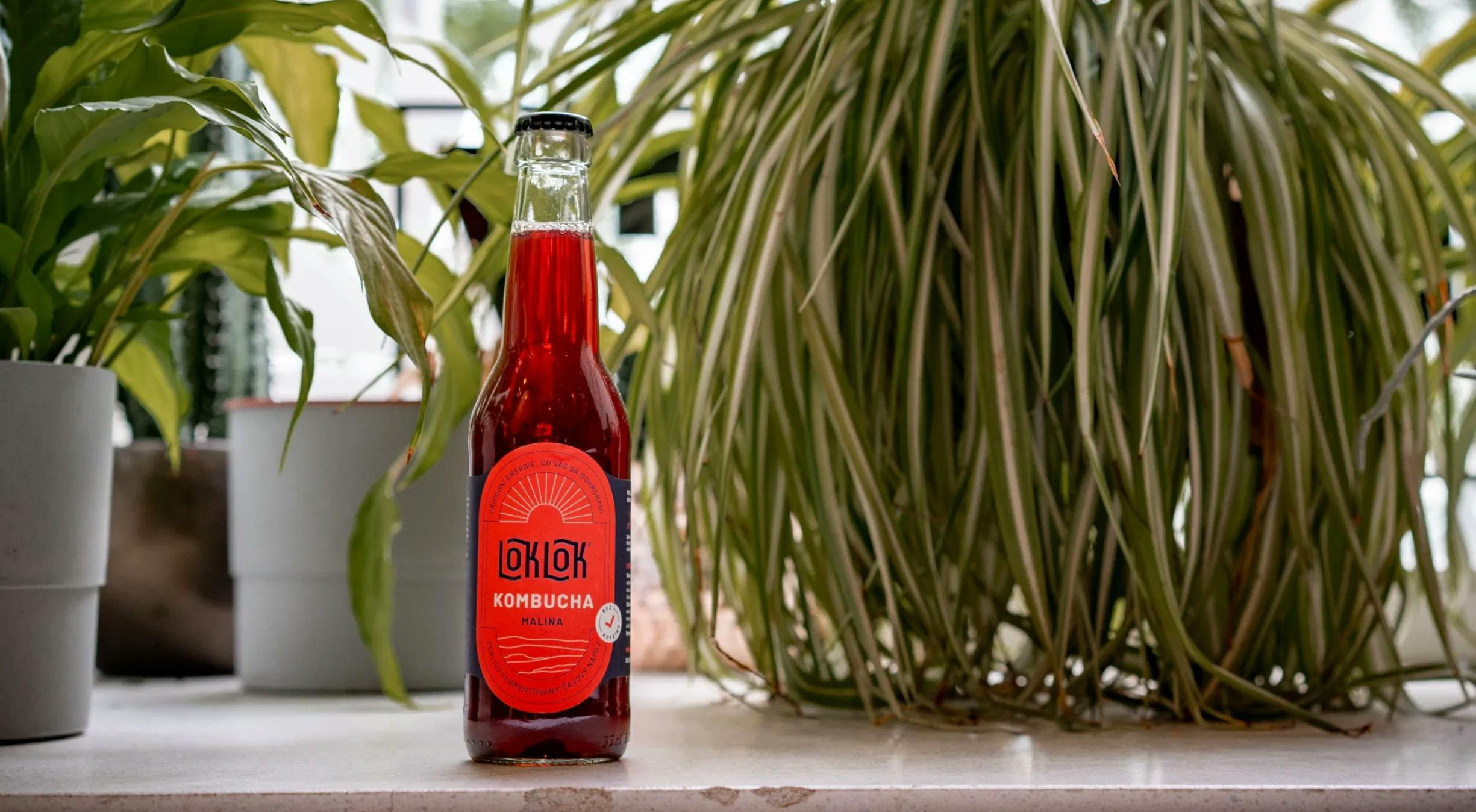
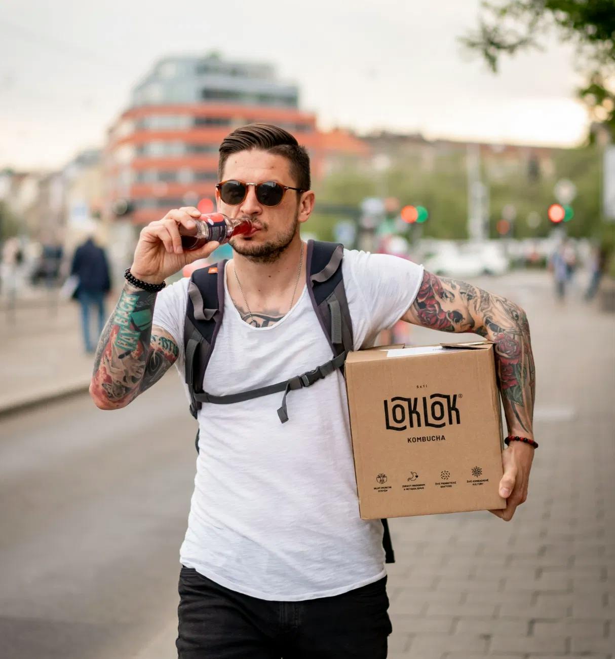
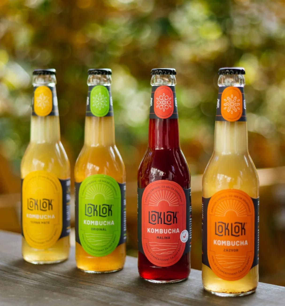
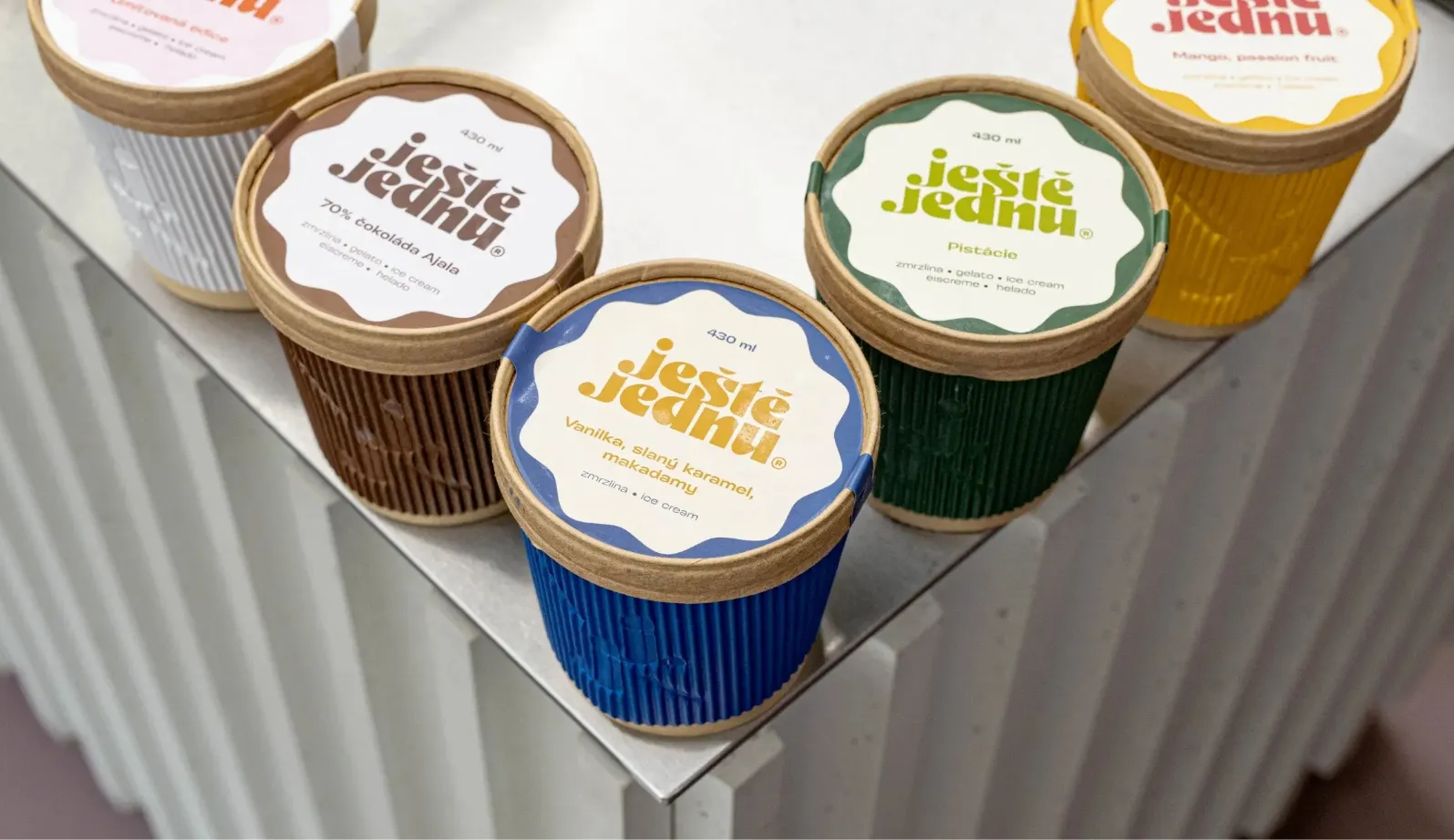
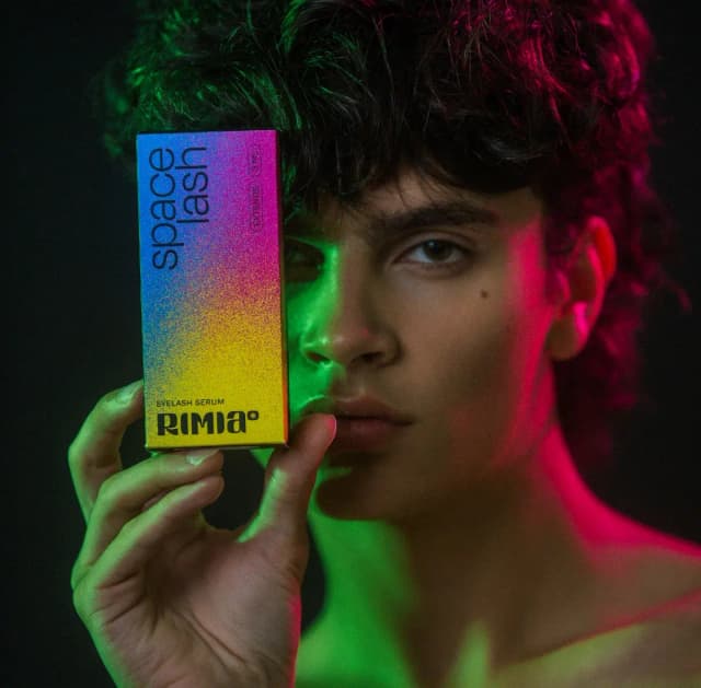
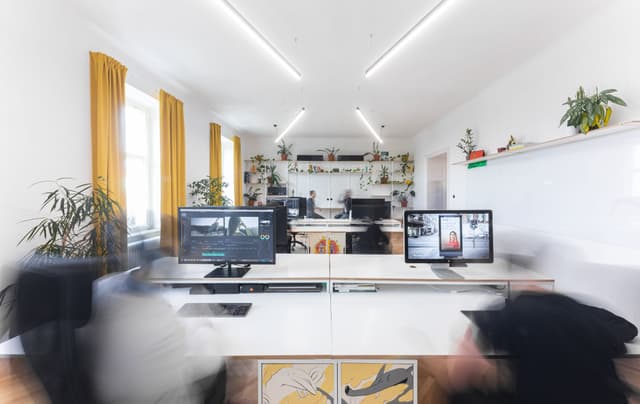
Branding & strategy for rising kombucha brand

CLIENTLoklok Czech Republic 2021
FIELDGastronomy
ROLEBranding Packaging Photo
RECOGNITIONJakub Maca Martin Horák

LokLok is a rising kombucha brand with an innovative modern approach to this traditional drink. LokLok wants to become a full-fledged alternative to alcoholic beverages and the brand's communication strategy is thus based on connecting people, traveling and a healthy lifestyle without inhibitions.

The new branding and packaging for LokLok kombucha combines a craft look with a slightly esotheric logo and a bold colour palette printed in spot colours with partial varnish. The boxes and labels also communicate the health benefits of the drink.

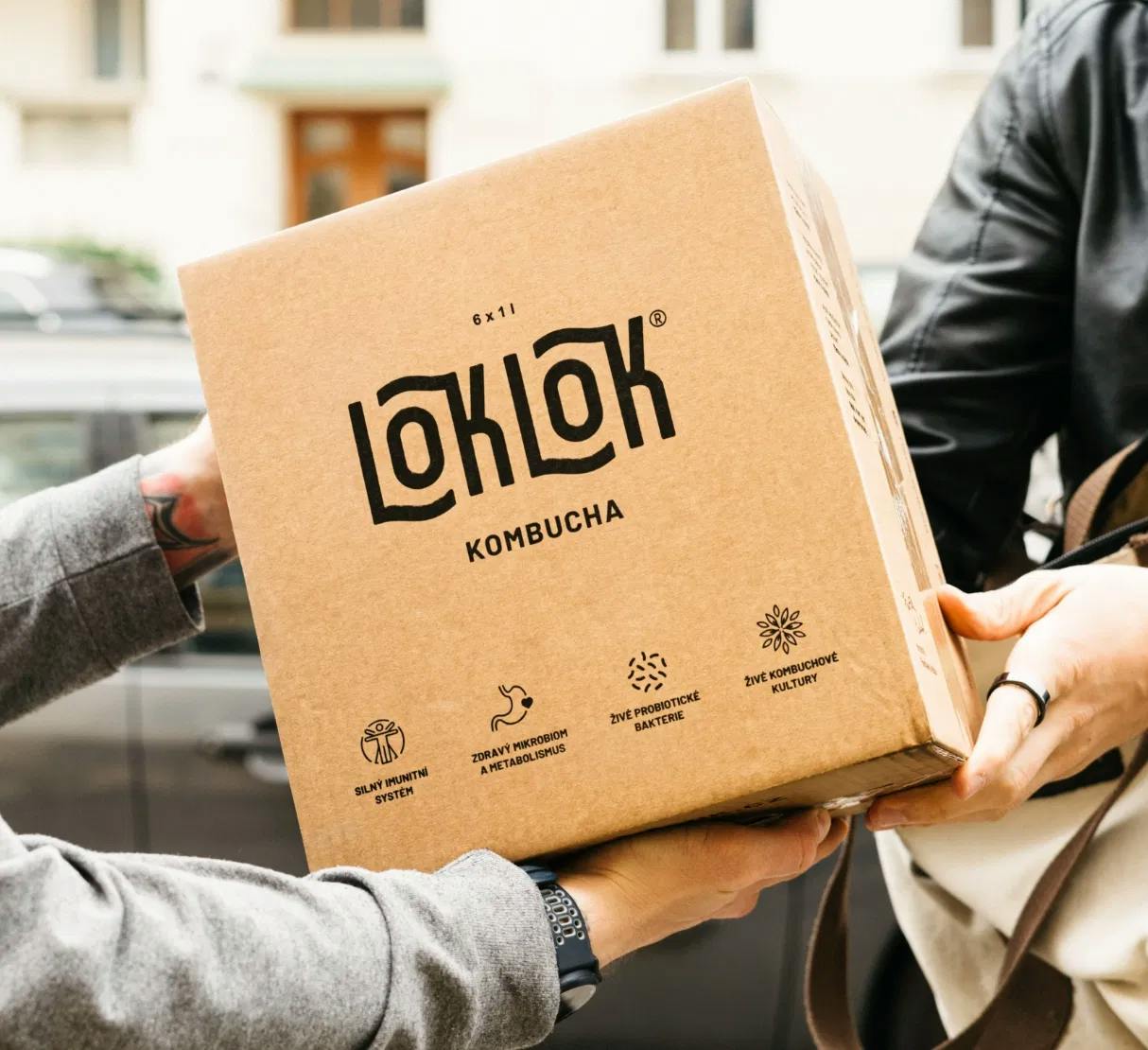
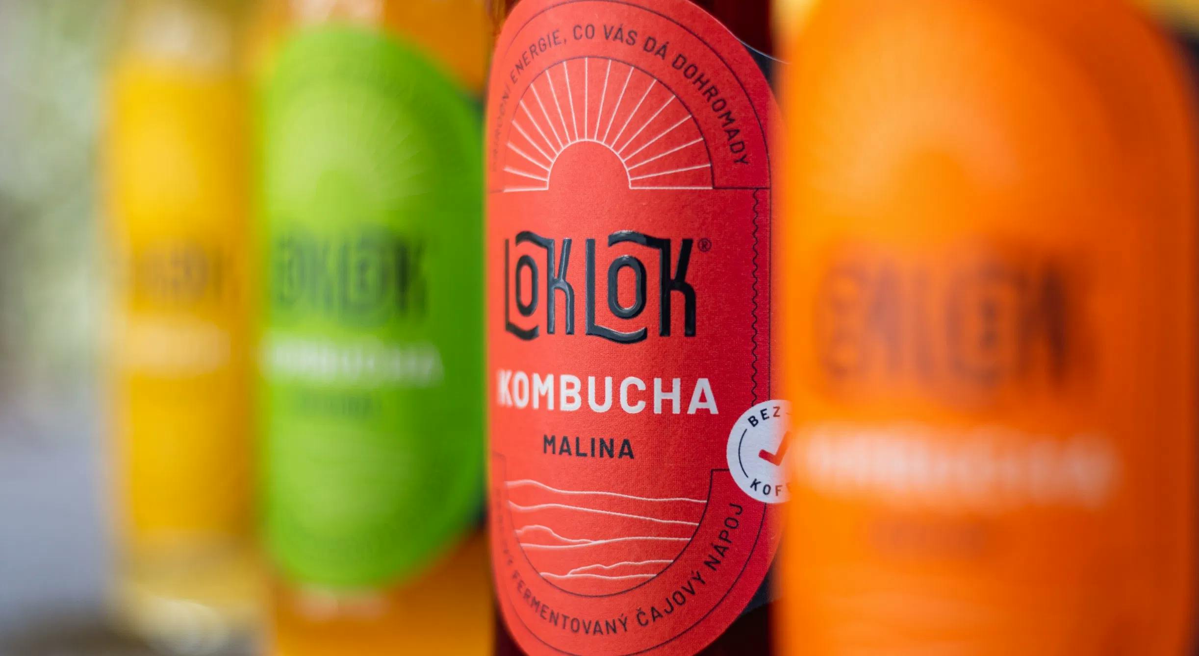
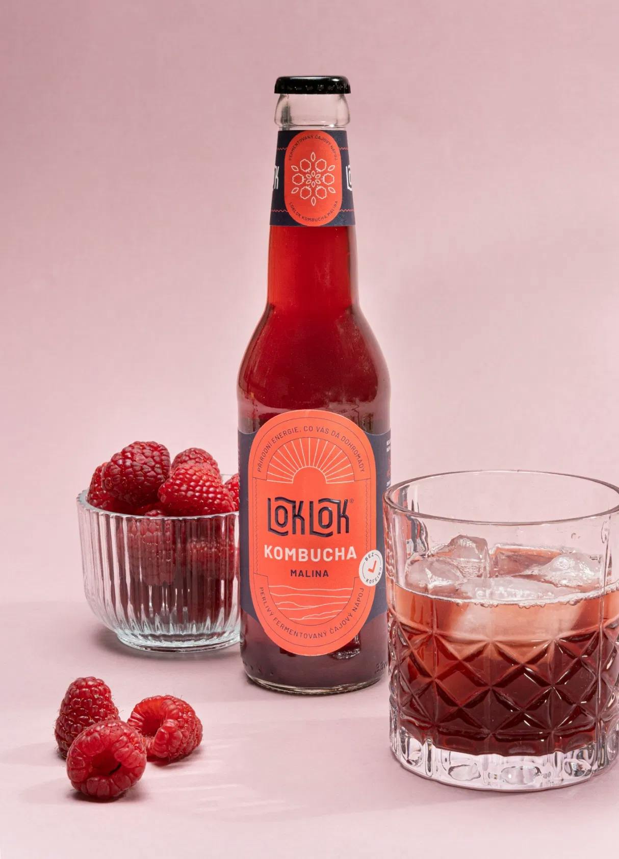
Working with Steezy was inspiring in itself. The visual identity that Kuba created for us captures our drink essence and we quickly identified with it. We also appreciate the quick application of the designs and the preparation of labels for our products. A major part of the personal approach, was to thoroughly define our brand and its goals at the beginning of our collaboration.

Michal Ďuriník
Co-founder @loklok